Jonathan and Valerie’s home is the only one I’ve ever designed that went through the rigorous test of both hurricane and earthquake during construction. While their Cockeysville, MD home was being renovated, it was in the path of a hurricane and near to the epicenter of an Earthquake where movement was felt on site. The home survived both. The irony of both situations is that during the design and construction of the home, we were working to ensure the stability of the design to withstand such sheer forces (horizontal forces like strong winds).
We were dramatically updating the look of this 1970s home to a modern, contemporary home and including numerous walls of windows. One of the ‘walls of windows’ in this home was more than 25 feet wide and 15 feet tall, spectacular but likely unable to resist sheer forces without significant structural reinforcement. There was a beam in the ceiling and we were planning to pile all this load on it. However, the beam wasn’t transferring the load to the foundation, as it needed to do. When starting a major home renovation project, everyone is leery of what they’ll find when they start demolition. Unfortunately in this situation, we weren’t able to determine that the load capacity of the beam was insufficient until we were in the demolition phase.
The structural engineer, the contractor and I got together to find a way to solve this problem. (We work on projects together often and I think very highly of both of them. They are both very, very smart and know a ton about residential construction.) First, the structural engineer proposed a solution to this problem; take out every other pane of glass. He knew I was not going to like the solution, but we had to start somewhere… his solution was sound structurally, but we needed a solution that would reinforce the design, not eliminate it. The contractor went next and we discussed the (expensive) idea of making a new foundation, underground. None of us liked that idea. We also discussed the idea of using a steel beam, but this too would have been very costly and taken budget away from other design features.
I said, ‘Let’s see what we can come up with to make this better.’ By examining our ideas, we realized we could shift the load to another beam about 6 feet away that did have the load-bearing capacity and the proper existing interior foundation. The new load bearing wall was also big enough and central enough to be used to counteract the sheer forces. We were able to keep the entire window wall intact and avoid the huge upcharges of the alternatives. Both huge victories. Teamwork, you gotta love it!
But that’s not what made this project so memorable–although that part I will likely never forget. Instead, this contemporary home is special because it has the nicest pantry in the state of Maryland.
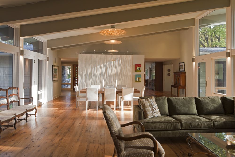
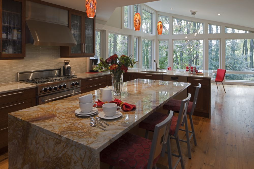
In our original design, the back wall of the pantry was where the load-bearing wall was. The pantry is located at the spot in the house where we transition from the 8 foot ceilings of the kitchen to the sloped 12 to 15 foot ceilings of the dining area and the living room. At first, we were going to have all four walls extend up to the varying ceiling heights. But when we shifted the load to another beam, the load-bearing wall became the wall on the front side of the pantry and we were no longer constrained with what to do with the other three walls. We decided to open them up–we brought the walls up to only 8 feet to be even with the load-bearing kitchen wall. We left the remaining height open, which kept the lines of the sloped ceiling visible and created for a dramatic statement when you enter into the pantry.
We then looked at how to accent this new design feature on the Dining Room and the Living Room side. We used visually appealing, interlocking panels from Modular Arts. They have a wavy texture that looks great and is an enhancement to the original design. This wouldn’t have happened if we didn’t have to make the structural changes.
But this project had one more claim to fame, literally.
The walls of windows we’d designed had asymmetrical window panes. Although the lower portion of the windows all were the same height, to accommodate the sloped ceilings of the interior, the top portion of windows were a cascading set of 4-sided polygon windows. We shared the plans with our window manufacturer, Marvin Windows, they said the shortest side could be no less than 6 inches… we had one window in the kitchen eat-in area that was going to exceed this minimum. One idea for a solution was to make that side larger. I felt that this would ruin the design of the house. ‘Only an architect would say that changing one window would ruin the whole thing,’ the contractor said. He was right about architects. But I was right about that window. The solution took a while, but we were able to make the window a little longer and we were able to raise the bottom of this window as well; the changes transformed the window from a polygon into a triangle.
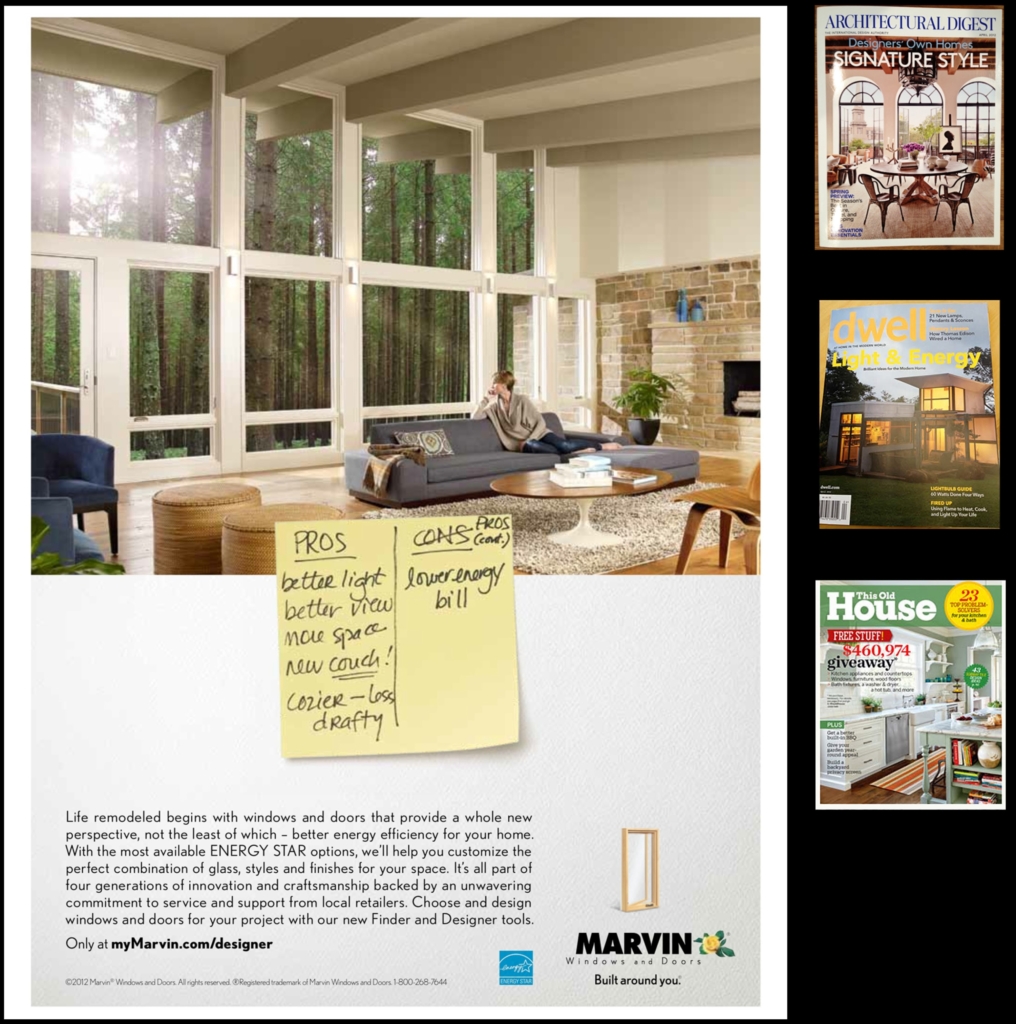
After we completed the project, I sent a thank you note to my Marvin representative and included a snapshot of the window. He was so impressed that he forwarded it to his national office. They asked if the design could be entered into a company-wide design contest; we said yes. We later learned that the design had won. As a result, the company wanted to feature the window in a national ad campaign, which ran in publications such as Architectural Digest, Good Housekeeping, Dwell, This Old House and many more.
What about the clients, you may ask? They are delighted with their home. So much so that, even though the husband got a job in Indiana, and despite receiving numerous offers for the house, they’ve decided not to sell but to instead fly back to their home for ‘vacations.’ The job is of a relatively short duration and they plan to move back and continue enjoying their home.
See more about Valerie and Jonathan’s home in our Portfolio.


