Bev and Jim loved their neighborhood and location but not their house. The first and biggest problem they had was due to the nature of a Split Level Home, the Family Room had no connection to the Kitchen. Other issues were (1) the Dining Room and the Kitchen were too small, (2) they wanted a Master Suite instead of a Bedroom and (3) Jim needed a home office where he could work 8 productive hours.
Simply put, they needed an addition and a Whole House Remodel.
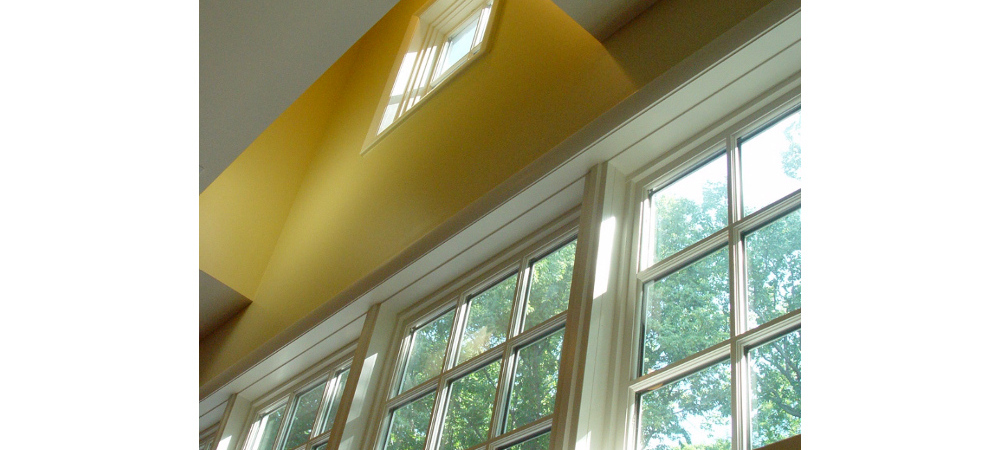
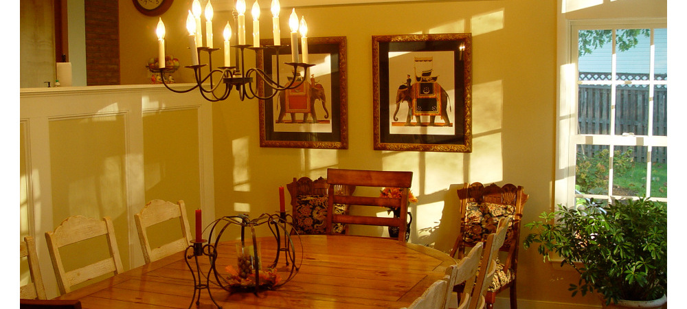
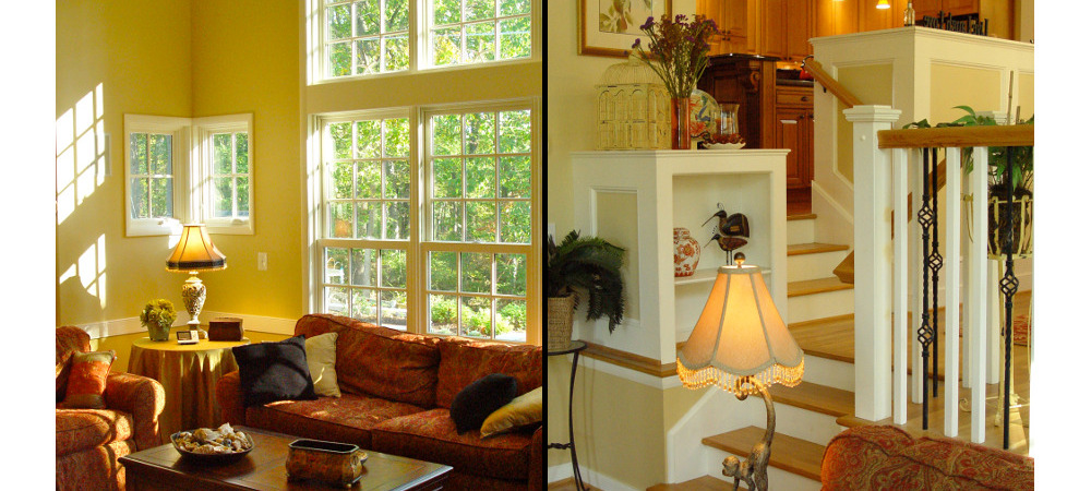
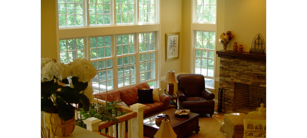
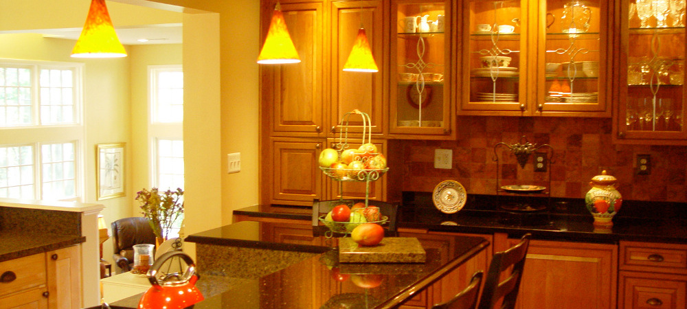
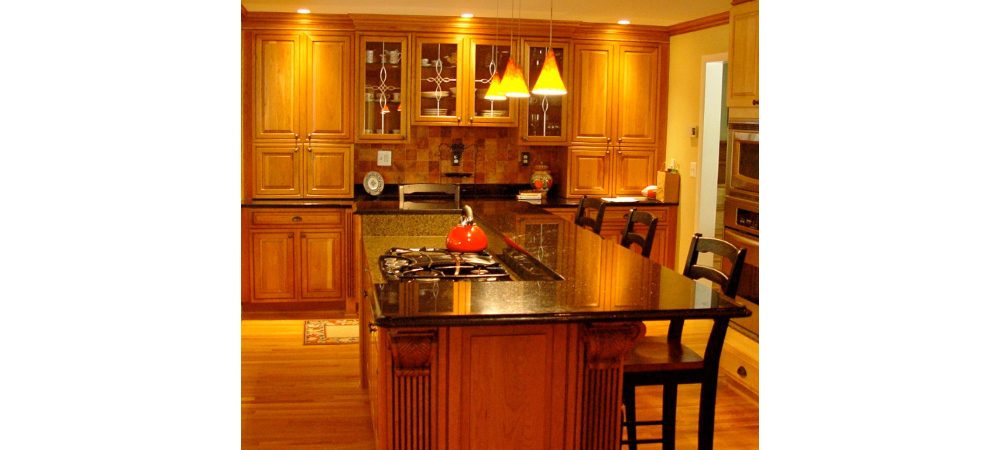
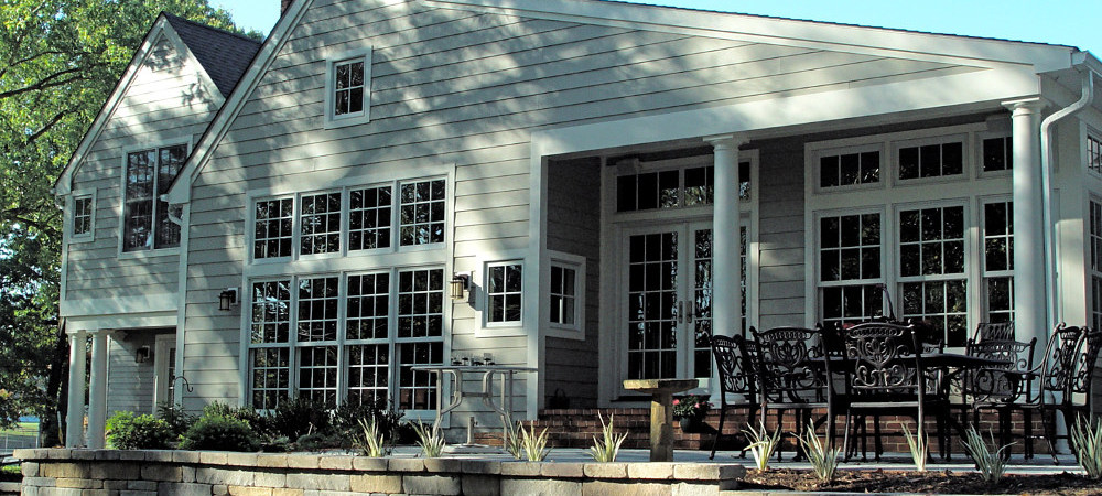
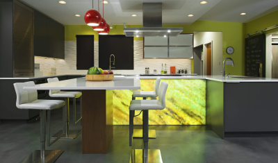
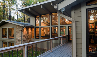
Bev and Jim also remarked that although they wanted and needed more space, they did not want their home to feel out of place in their neighborhood. After talking through these needs and what they liked about their home as it was and what they did not like and why, I set out to transform the house where they lived into their dream home. To connect the Family Room and the Kitchen, I proposed an addition in the location of the Sun Room that no one used, half a level below the Kitchen. Then I added a Dining Room roughly 2 feet below the Kitchen and 2 feet above the Family Room, literally adding an in-between level to the Split Level. With the aid of a rather large beam, we removed the exterior wall at the kitchen and bumped it out the 3 feet that we needed to create an island in the Kitchen. The island made the kitchen seem much bigger and created a new traffic pattern which went around instead of through the working end of the Kitchen. Now the Kitchen overlooks both the Family Room and Dining Room, making serving and clearing the dishes a breeze. To visually tie these rooms together I insisted that we maintain a constant ceiling height. So the room volume increases as one descends from the Kitchen, first to the Dining Room and increases further for the Family Room. To heighten the effect of the volume change of the spaces, windows dramatically increase in size as the ceiling height increases.
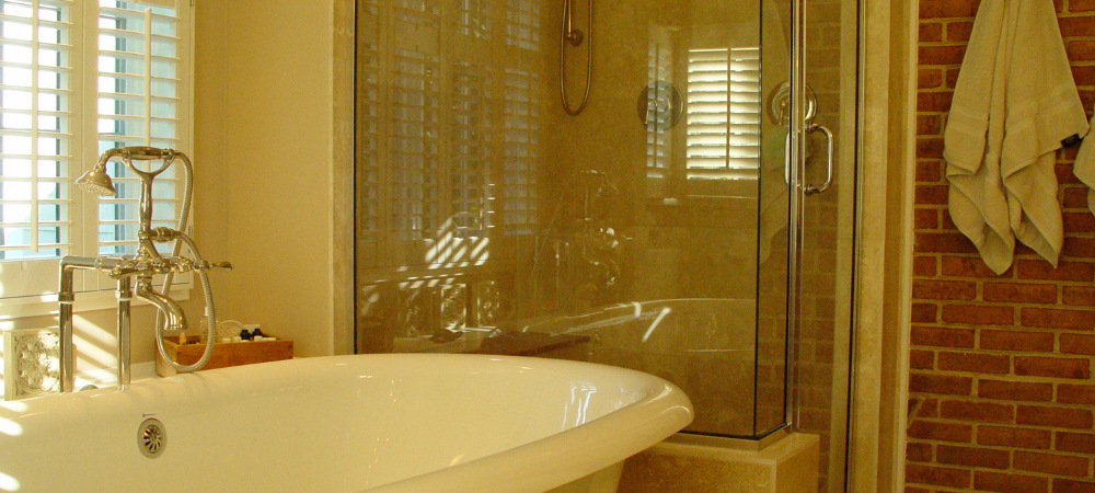
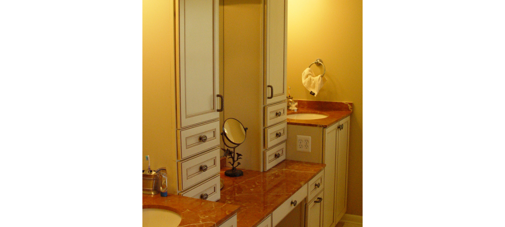
As a final touch, we designed a clearstory window slot – only about 3 feet deep, five feet wide and about six feet tall – above the ceiling to bring in light from above and to enhance the beauty of the Rear Facade. The design of the Master Suite and the Home Office worked best as an addition. We started with the Master Bedroom, locating it just outside the existing home so that we could vault the ceiling in the room. We transformed the existing Master Bedroom into a generous Walk-in-Closet and a Hallway. The Hallway added more privacy, and minimized the amount of work to the existing home. The Master Bath was custom designed for Bev and Jim, starting with the counter heights of the Vanity. One height for her Make-up table with a 36″ high counter height for her sink, jumping up to 42″ height for his. We decided to expose the brick from the existing chimney and use it for color, texture and a place to hang towels and robes with hooks. Jim’s Office needed to be remote from the rest of the home acoustically, yet attached physically.
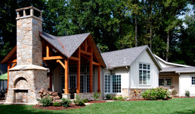
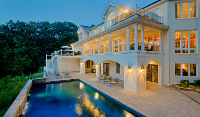
We created a vestibule just off the old Family Room, which became a Billiard Room, and created, essentially, a Guest Suite complete with a Bathroom and Walk in Closet – the Bathroom for convenience and the Walk in Closet for storage and the fax/copier machine. The closet keeps the office neat, keeping all of the necessary equipment close but out of view. To keep the home similar in size and feel from the front, we moved the Master Suite/Office addition back from the Front Facade. This worked so well that first time visitors are often very surprised as they walk through the home as rooms are much bigger and airier than they expected driving up. Lastly, Bev and Jim really wanted to connect their wooded view and private backyard with the home’s interior. With the help of Maxaela’s we were able to move enough dirt around to create a beautiful patio just off the Dining Room, very close to the Kitchen and Family Room. This Patio extends the living space of the home, visually bringing the outside in, living closer to nature.

