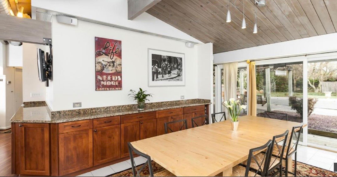
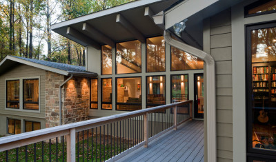
Lisa and Chris’ mid-century modern home was exactly what they were looking for–a period home with great exterior architecture, clean lines and simple massings. The inside, however, was a hodgepodge of years of renovations, and frankly a floorplan that never lived up to the mid-century modern exterior. There were several small rooms all with odd angles. The choppy layout had no flow from room to room. Spaces were compartmentalized with no relation to one another; including the kitchen which was completely cut off from the rest of the home.
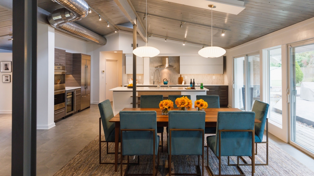
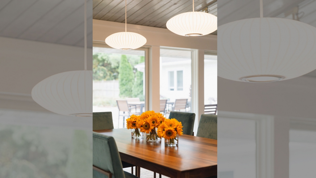
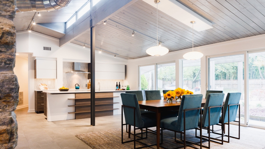
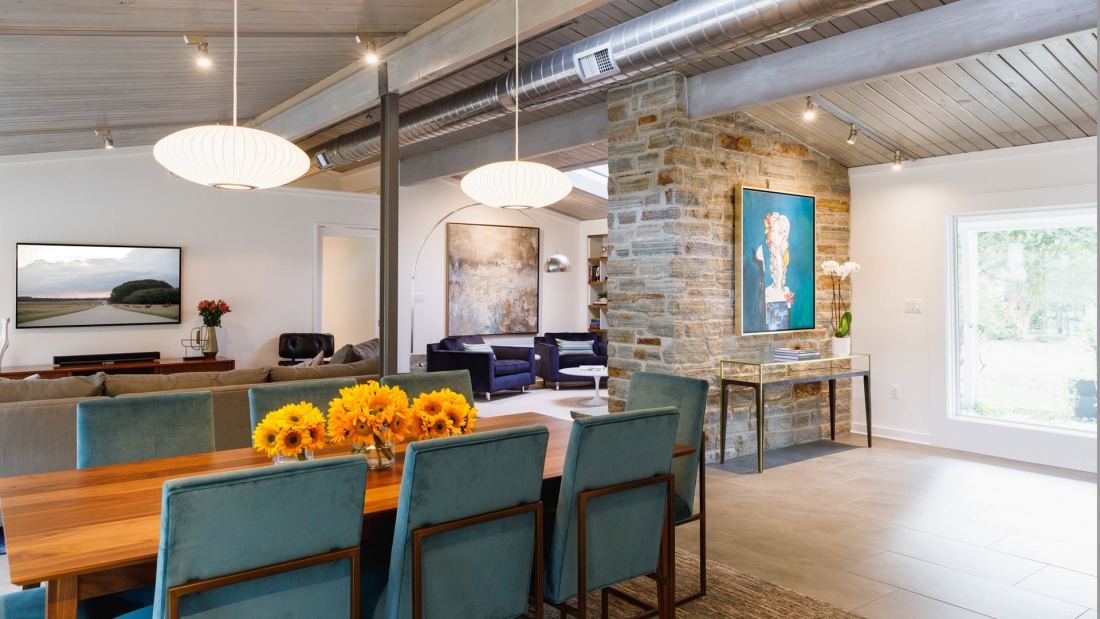
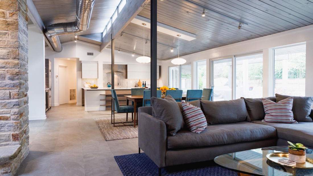
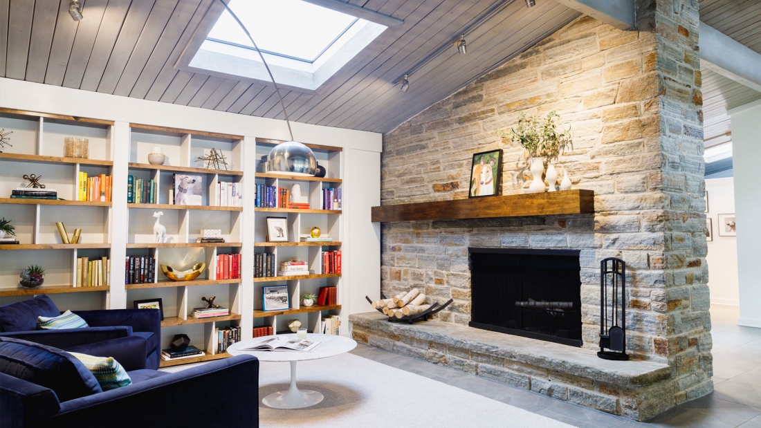
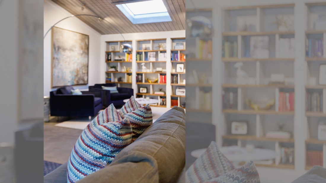
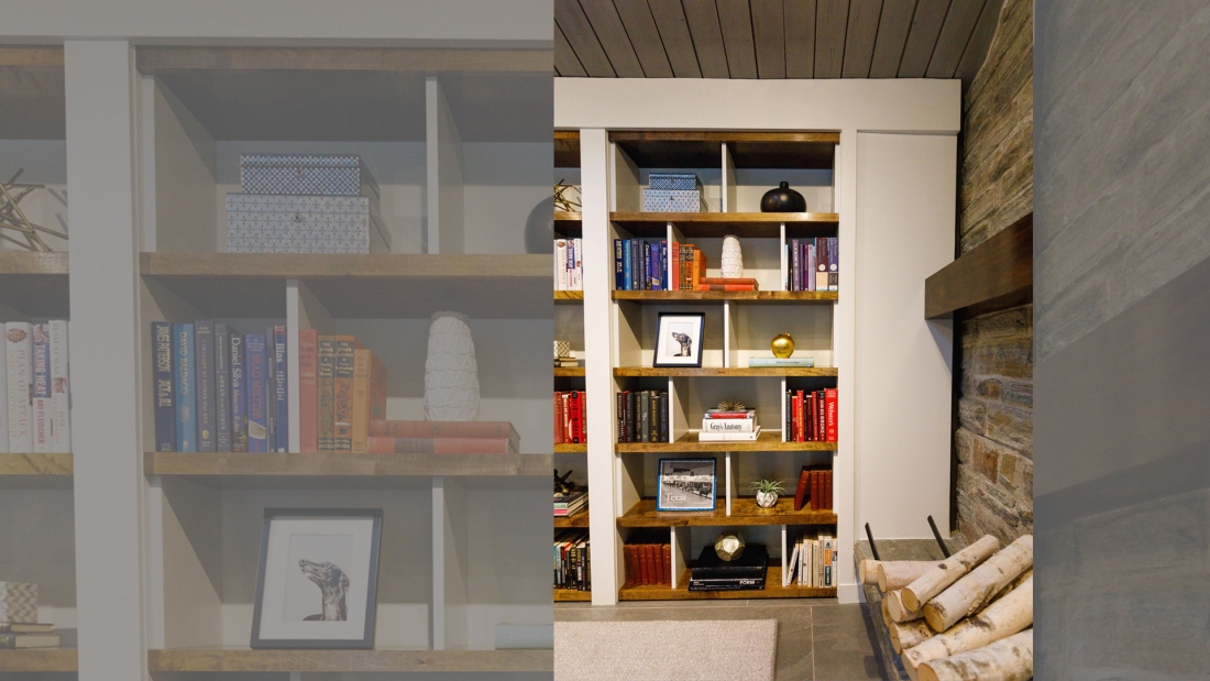
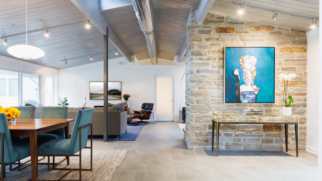
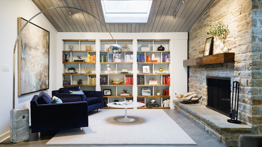
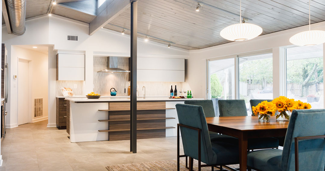
Chris and Lisa wanted to open up the main living area to create one large space under the peaked ceiling of the original structure. (One of the only things kept from the original design were the tongue and groove, wood-clad ceiling treatment of the peaked ceiling.) We took down the wall between the kitchen and dining area. We removed a large center support structure in the middle of the home that was grossly oversized at nearly 6 feet in diameter and replaced it with a single post–this alone allowed us to create a unified space. We took advantage of an exposed stone fireplace that created an alcove from the open plan living space to create a library. We then removed layers and layers of white paint that had been covering the stone. This revealed the natural, beautiful look of the quarried butler stone bricks. We also replaced four different floorings (wood, white tile, brown tile, and carpet) with an 18×12 natural stone in a medium gray tone.
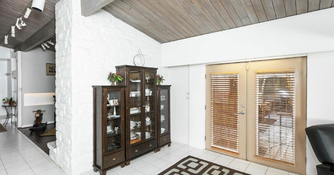
Before
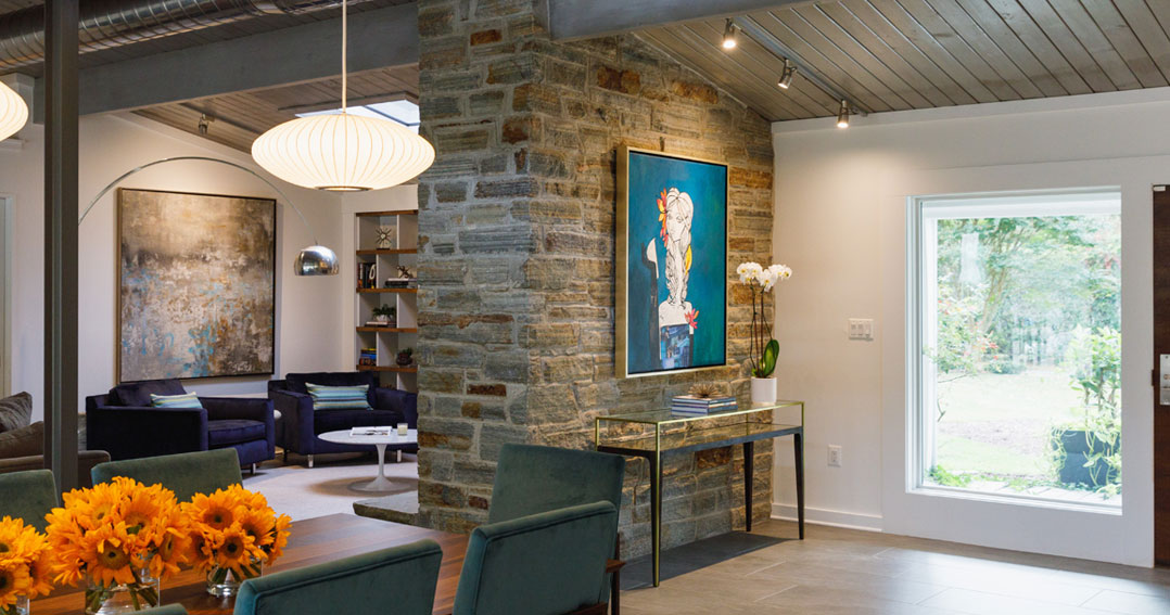
After
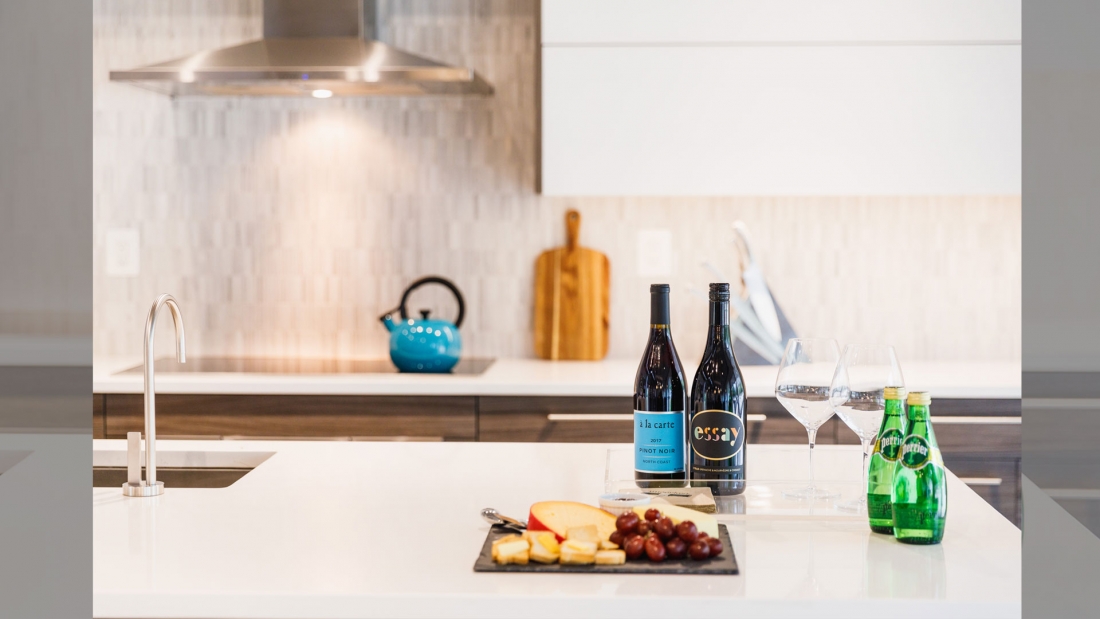
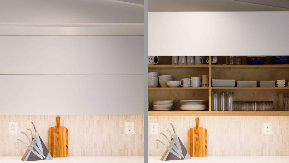
We continued the warm tone from the flooring with the European style, flat front cabinets in the kitchen. First is the bank of cabinets with the refrigerator, double ovens, and wine fridge where we used horizontal grain wood. We also used this same cabinetry on the lower cabinets of the island and near the cooktop and used bright white cabinets for the uppers with vertical opening, garage style hinges (stay lift cabinet doors) that lift the door and keep it parallel with the cabinet. Large modern style cabinet pulls, sleek appliances, and white quartz countertops complete the look of this modern kitchen.
Architecture: 2e Architects
Interiors: Lela Knight Interiors
Construction: Batton and Sons
Photography: Julie Hove Andersen

